
Kitchen color ideas · Pink Flamingo field guide
Kitchen colors with a little backbone
Warm kitchens are back, but “warm” does not mean beige from floor to ceiling. The trick is choosing a color that works with the fixed pieces you already own.
Deep olive: the confident neutral
Olive sits comfortably beside warm wood, aged brass, cream stone, and many brick or terra-cotta tones. On cabinets it can feel grounded instead of trendy, especially when the room has good natural light.
In a darker kitchen, keep the walls and ceiling quieter so the green has room to breathe. A muddy olive that looks rich on a sample can turn nearly black under cool recessed lights, so test a large board before committing.
Oxblood and muted plum: color without the carnival
A deep red-brown or dusty plum can be handsome on an island, pantry wall, or lower cabinet run. These shades bring personality without the candy-store brightness of a pure red or purple.
They work best when something else in the room repeats the warmth: wood floors, leather, veined stone, aged metal, or a rug. If every fixed surface leans cool blue-gray, the combination needs more care.
Creamy brown and mushroom: easier than plain gray
Mushroom, putty, and creamy taupe give a kitchen depth while staying flexible. They are useful when bright white makes the counters look yellow or when yesterday’s cool gray makes the wood feel orange.
Watch the undertone. Put the sample directly beside the backsplash and countertop, not on the opposite wall where everybody can pretend the conflict is not happening.
Muted yellow: sunshine with indoor manners
A soft ochre, wheat, or buttery yellow can warm an eat-in kitchen or a room with northern light. The successful versions are softened with gray or brown, not sharpened into school-bus territory.
Use it on walls with cream trim, as a small cabinet accent, or on a back door. It can make an older Maryland kitchen feel cheerful without sanding away its character.
Wood still counts as a color
Natural or stained wood has hue, temperature, and visual weight. If the cabinets are staying, choose the wall color around them. If some cabinets are being painted, a wood island or open shelf can keep the room from feeling like one long sheet of enamel.
The best kitchen palette is the one that makes the counters, floors, cabinets, and light look like they belong to the same house.
Got a painting question?
Tell us what you are looking at. We will give you a straight answer and a sensible next step.
Book a free estimate6 Kitchen Paint Colors Maryland Homeowners Will Be Loving in 2025
By Justin Pisarra, Owner of Pink Flamingo Painting Co.
From bethesda to Clarksville - These Kitchen Colors Are Picking Up Steam
Thinking about updating your kitchen? A fresh coat of paint might be all you need.
In neighborhoods like Clarksville, Bethesda, and Fulton, we’ve seen how the right paint color can completely change a kitchen without the hassle (or cost) of a full remodel. Whether you’re working with older cabinetry or designing a new build, these six kitchen colors are poised to take over in 2025 …. and for good reason.
They’re versatile, grounded, and surprisingly easy to live with!
Here’s what’s coming - and why it works so well for Maryland homes….
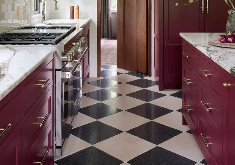
1. Oxblood Red
Rich, Retro, and Confident
Where it works best: Kitchen islands, lower cabinets, cozy rowhomes
You’ll love it if: You want something bold, but not trendy for trendy’s sake
Oxblood isn’t loud but it makes a statement. This deep, wine-toned red adds warmth and instant character. It looks great with brass hardware, natural stone counters, or white oak floors.
We’re seeing this color show up in everything from classic Bethesda townhomes to updated kitchens in Ellicott City.
Color Match Suggestions:
Farrow & Ball – Preference Red No. 297 (rich, elegant, and timeless)
Benjamin Moore – Dinner Party AF-300 (grown-up red, deep wine and oxblood tones)

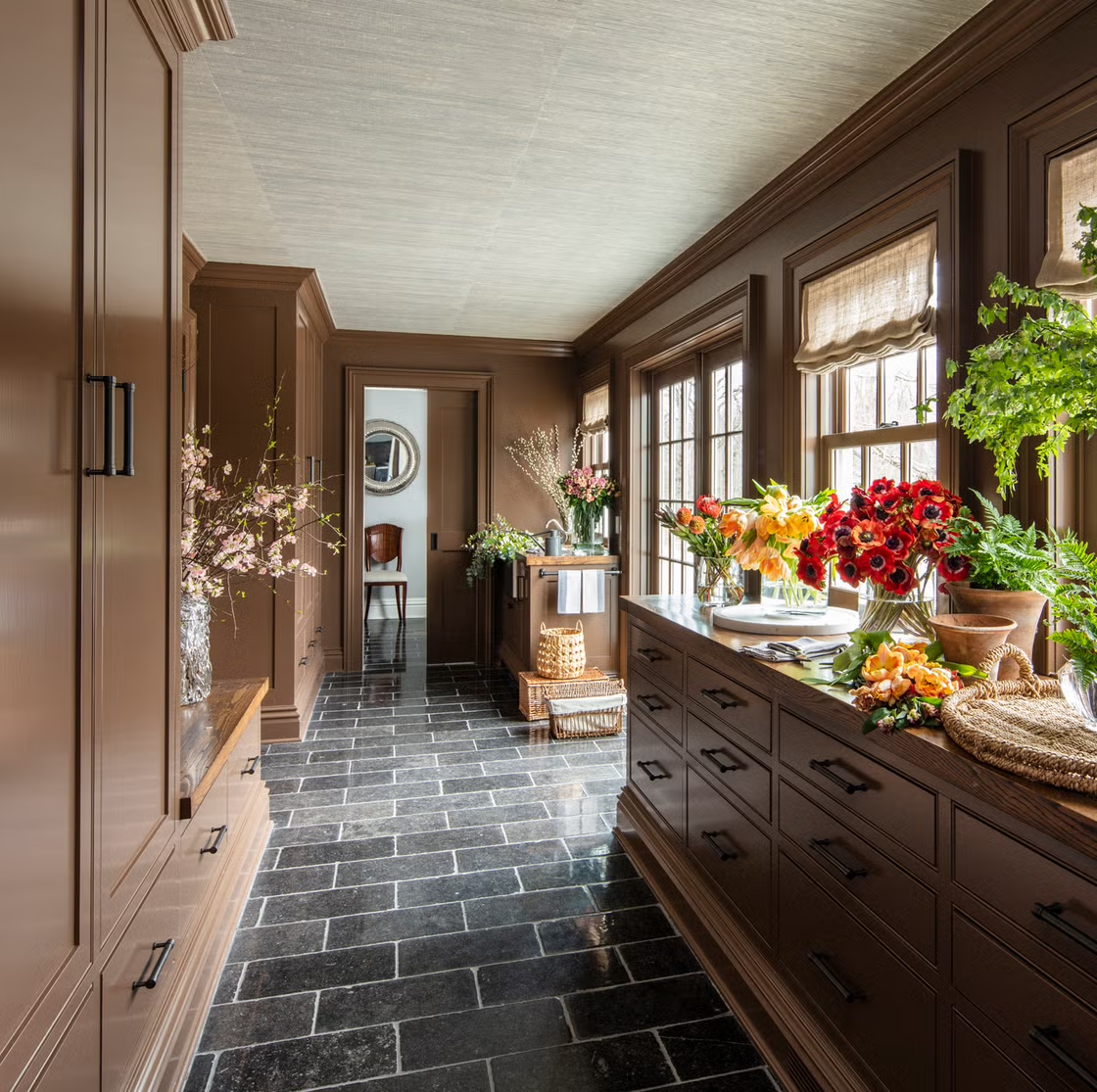
2. Creamy Brown
Understated, Cozy, and Totally Current
Where it works best: Full cabinet repaints, butler’s pantries, open shelving setups
You’ll love it if: You like earth tones that don’t feel flat
Mushroom, mocha, and greige tones are quietly becoming the new neutrals. They bring softness and depth without veering too yellow or beige and they play well with marble counters, wood floors, and matte black accents.
In places like Columbia and Olney, we’ve seen these warm neutrals paired beautifully with soft whites or oak trim.
Color Match Suggestions:
Benjamin Moore – Smokey Taupe 983 (earthy and versatile, not muddy)
Sherwin-Williams – Loggia SW 7506 (warm taupe with soft depth)
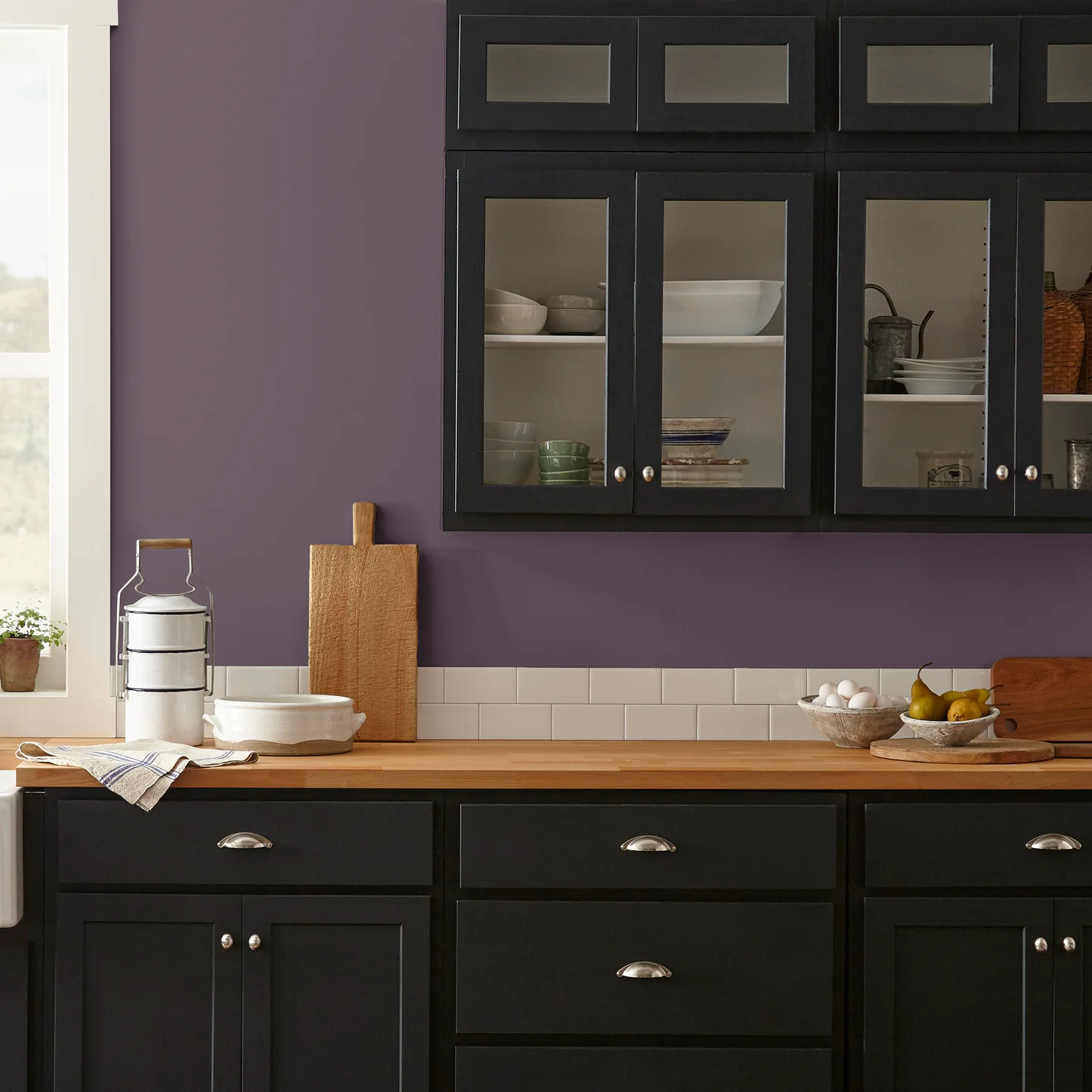
3. Muted Plum
Unexpected, Elegant, and Easy to Live With
Where it works best: Compact kitchens, statement walls, cabinet makeovers
You’ll love it if: You want color that’s bold but still subtle
Somewhere between purple, gray, and espresso, muted plum is one of those colors that turns heads in a good way. It’s luxurious but not flashy, and it works especially well in homes with natural light and wood textures.
We’ve seen this look catch on in Kensington and Mount Airy, especially in homes that balance charm with clean, modern touches.
Color Match Suggestions:
Sherwin-Williams – Plum Brown SW 6272 (deep, balanced plum with earthy tones)
Benjamin Moore – Shadow 2117-30 (moody, complex, and design-forward)
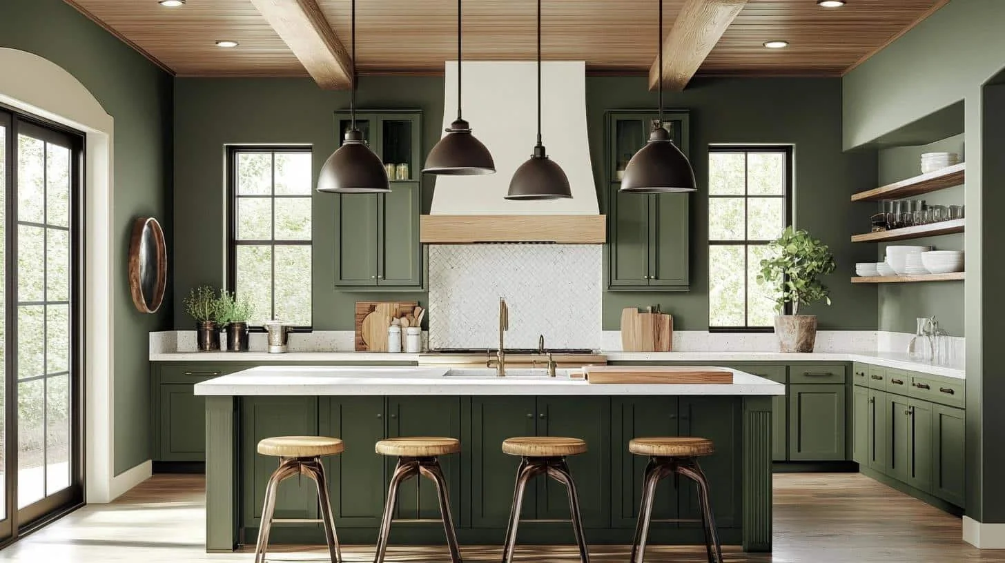
4. Deep Olive Green
Organic, Grounded, and Built to Last
Where it works best: Shaker-style cabinets, full repaints, natural wood kitchens
You’ll love it if: You want something timeless that still feels fresh
Olive green is sticking around for 2025 but it’s going deeper and dustier. It’s more forest-meets-charcoal than avocado, and it’s perfect for kitchens with exposed beams, creamy quartz, or big windows.
Homeowners in Clarksville and Ashton are loving how grounded and natural this shade feels.
Color Match Suggestions:
Sherwin-Williams – Ripe Olive SW 6209 (deep, earthy green with classic appeal)
Benjamin Moore – Sussex Green HC-109 (calm and soft, with a heritage feel)

5. Muted Yellow
Cheerful, Soft, and Full of Personality
Where it works best: Breakfast nooks, accent walls, vintage-style kitchens
You’ll love it if: You want to brighten up the room without going full lemon
Today’s yellows are dustier, earthier, and easier to live with. Think custard, ochre, and soft chartreuse just enough color to add life without overwhelming.
They’re popping up in homes across Takoma Park and Rockville, where sunlight, wood, and character all come together.
Color Match Suggestions:
Sherwin-Williams – Jonquil SW 6674 (soft yellow with warmth)
Benjamin Moore – Soleil AF-330 (muted, elegant yellow with a golden undertone)

6. Earthy Wood Tones
Classic, Natural, and Always in Style
Where it works best: Any kitchen with good light, natural wood, or character
You’ll love it if: You’re drawn to warmth, texture, and timeless design
Natural wood cabinets are making a big comeback and if yours are in good shape, this might be the year to celebrate them. Rich cinnamon, saddle, or warm brown paint can mimic the feel of stained wood without losing that natural vibe.
In Highland and Potomac, homeowners are loving this look for the way it brings calm, charm, and real texture into the kitchen.
Color Match Suggestions:
Sherwin-Williams – Foothills SW 7514 (Rich, warm saddle brown with slight taupe undertones)
Benjamin Moore – Barista AF-175 (Elegant, coffee-inspired deep brown with subtle softness)

About the Author
Justin Pisarra runs Pink Flamingo Painting, serving homes across Montgomery and Howard Counties. He grew up in Chevy Chase and started painting in the late ’90sfirst for friends, then neighbors, then people looking for someone reliable who actually cares.
These days, he still shows up with the same mindset: do clean work, be honest, and make the space feel right. Justin lives in Fulton, Maryland with his wife, Laura. When he’s not painting, you’ll probably find him tinkering with his old Miata, watching Formula 1, wandering through neighborhoods looking for standout architecture—or digging through antique shops in Kensington or Ellicott City.
Ready to give your kitchen a fresh start?
If your home needs a refresh—or you’re just tired of guessing at colors that don’t work—Pink Flamingo Painting can help. We specialize in timeless, neighborhood-friendly palettes that still let your personality shine.
Locally trusted in Bethesda, Columbia, Rockville, Ellicott City, and surrounding areas
Thoughtful color guidance, clean execution, and no pushy upsells—just honest work
Click below to schedule a free estimate—we’ll help you fall in love with your home again.